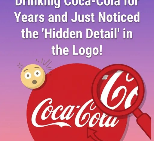
Sometimes, it takes only a fleeting moment for something familiar to transform entirely in our eyes. A small observation, a passing comment, or a shift in perspective can reveal a detail we’ve overlooked for years—and once we see it, we can’t unsee it. Many people experience this with the iconic Coca-Cola logo. At first glance, it’s simply elegant script. But look closely at the second “C” in “Cola,” and its curved line can begin to resemble a soft, subtle smile. From that point on, the logo can feel less like a piece of typography and more like a quiet expression of warmth, as if the brand itself is greeting you.
What makes this especially intriguing is the question it raises: was that “smile” ever meant to be there, or is it something we’ve collectively imagined?
To understand this, it helps to go back to the origins of the logo. In the late 19th century, Frank Mason Robinson, the bookkeeper for the company, designed the now-famous script using Spencerian handwriting—a popular style at the time known for its flowing, decorative curves. His goal wasn’t to hide messages or embed emotional symbolism, but to create something distinctive, legible, and visually appealing. The sweeping loops and elegant strokes were simply a reflection of the artistic standards of that era. There’s no historical evidence suggesting that Robinson intended for any letter to resemble a smile or carry deeper meaning.
And yet, over time, the way people perceive the logo has shifted.
As Coca-Cola grew into one of the most recognizable brands in the world, it became tied to powerful emotions and shared experiences—holiday traditions, summer afternoons, family gatherings, and moments of simple joy. Advertising reinforced these associations, consistently linking the brand with happiness, connection, and comfort. Gradually, these feelings began to influence not just how people thought about the product, but how they saw it. The same curves that once served only as decoration started to feel intentional, almost expressive. That gentle arc in the “C” no longer looked neutral—it looked friendly.
This shift says less about the logo itself and more about how the human mind works. Our brains are wired to search for patterns and meaning, especially when it comes to faces and emotions. This tendency, known as Pareidolia, leads us to see faces in clouds, expressions in everyday objects, and even personality in abstract shapes. Once a suggestion is planted—like the idea of a “smile” in the logo—our brains eagerly reinforce it, connecting it to the positive emotions we already associate with the brand.
Over time, those interpretations can feel just as real as the original design.
In that sense, enduring symbols live two parallel lives. One is rooted in their creation—the practical choices, artistic influences, and intentions of their designers. The other is shaped by us: by memory, emotion, culture, and imagination. The “smile” in the Coca-Cola logo may not have been part of the original blueprint, but it has become part of its story nonetheless.
And perhaps that’s what makes it so compelling. It’s a quiet reminder that meaning doesn’t always come from what was planned—it often emerges from how we choose to see.