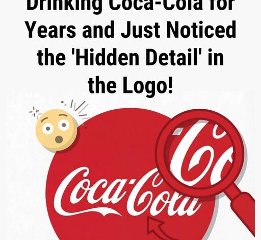
At first glance, it’s just a logo—familiar, timeless, almost too recognizable to question. But look a little closer, and something curious begins to emerge. The flowing script of “Coca-Cola,” especially that second “C” in “Cola,” seems to carry a subtle personality of its own. Its curve feels intentional, almost playful—like a gentle smile hidden in plain sight, quietly greeting you every time you see it.
It’s the kind of detail you can’t unsee once it clicks.
And yet, historically, there’s no evidence that it was ever designed that way.
The iconic logo dates back to the late 1880s, created by Frank Mason Robinson. At the time, his choice of script wasn’t about hidden meanings or emotional cues—it was simply fashionable. Spencerian script, with its elegant loops and flowing lines, was widely used in business writing. It conveyed sophistication, readability, and a sense of refinement. There were no secret notes, no marketing strategies, no early advertisements hinting at a smile tucked into the lettering.
But that hasn’t stopped people from seeing one.
Because the truth is, the “smile” doesn’t come from the design—it comes from us.
Human perception is wired to find patterns, especially faces. It’s why we see shapes in clouds, expressions in car headlights, and emotions in abstract art. Our brains naturally search for familiarity and meaning, even when none was intentionally placed there. So when we look at that curved “C,” we instinctively interpret it as something warm, something human.
Over time, Coca-Cola as a brand leaned heavily into those very emotions—joy, togetherness, nostalgia. Through decades of advertising, storytelling, and cultural presence, the company didn’t just sell a drink; it sold a feeling. Holidays, family moments, laughter shared between friends—all became part of the brand’s identity.
And slowly, that curve began to feel like more than just a letter.
It started to feel like a smile.
Whether it was ever meant to be there almost becomes irrelevant. The meaning has evolved beyond its original intent. What began as simple penmanship has transformed into something layered—part design, part psychology, part cultural memory.
That’s the fascinating thing about iconic symbols. They don’t stay static. They grow with us, shaped by how we see them and what we associate with them. The Coca-Cola logo is no longer just ink on a label—it’s a shared experience, interpreted through generations.
So the next time you glance at that familiar red and white script, take a second look.
That smile you see?
It might not have been drawn there…
…but it’s real all the same.