Why an Upside-Down Outline of Washington State Quietly Became One of the Most Recognizable Symbols of Regional Identity, Humor, and Belonging Across the Pacific Northwest Over the Past Decade, Capturing the Spirit of a Place Where Subtlety Speaks Louder Than Words and Shared Meaning Matters Most
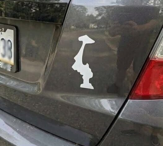
If you spend enough time driving through the Pacific Northwest—especially across Washington—you start to notice a small, curious detail that feels too consistent to be random. It shows up everywhere: on the backs of mud-splattered Subarus, on dented water bottles clipped to hiking packs, on the lids of laptops in softly lit coffee shops where the air smells like espresso and rain. At first glance, it looks like a simple outline of the state.
Then you realize something is off.
It’s upside down.
At first, it’s easy to dismiss. Maybe a printing error. Maybe a one-off design choice. But the more you see it, the harder it becomes to ignore. It’s everywhere—and clearly intentional. Quietly, repeatedly, deliberately so.
And like many things in the Pacific Northwest, its meaning isn’t loudly explained. It’s absorbed.
What makes this symbol so interesting isn’t just the flipped design—it’s how it spreads. There’s no official campaign behind it, no brand pushing it, no widely agreed-upon origin story. It moves the way local culture often does here: through observation, curiosity, and quiet adoption. Someone notices it, wonders about it, maybe asks a friend—or maybe doesn’t—and eventually starts using it too. Over time, they become part of an unspoken network of recognition.
That kind of subtle, almost invisible transmission fits the region perfectly. Identity here isn’t usually broadcast—it’s implied.
The upside-down state outline seems to have emerged in the early 2010s, when state decals became popular across the U.S. People everywhere were putting their home states on cars and gear, a simple badge of pride. But in Washington, the idea took a slight turn—literally. Instead of following the trend exactly, people flipped it.
A small shift. But one that stuck.
Part of the appeal is visual. Washington’s shape is distinct enough that even inverted, it’s still recognizable. That makes the flip feel playful rather than confusing—like a quiet inside joke that doesn’t need explaining.
And like any good symbol, it gathered meanings over time.
One of the most common interpretations leans into the region’s famously gray, rainy climate. The joke is simple: it rains so much that the state might as well be upside down. It’s self-aware, a little dry, and very on-brand. Instead of resisting the weather, people fold it into their identity. The sticker becomes a kind of shrug and smile at the same time—an acknowledgment without complaint.
Another reading is more visual, almost poetic. When flipped, the outline can resemble a mountain silhouette—something that inevitably brings to mind Mount Rainier. For hikers, climbers, and anyone who’s spent time staring at that snow-capped presence on the horizon, this interpretation adds a deeper layer. The sticker stops being just a shape and starts echoing the landscape itself.
Whether that resemblance was intentional or not almost doesn’t matter anymore. It feels true, and that’s enough.
But beyond humor or symbolism, the upside-down design reflects something broader about the culture of the Pacific Northwest. In many places, pride is loud—flags, slogans, bold declarations. Here, it tends to be quieter. More coded. More personal.
The flipped outline doesn’t demand recognition. In fact, part of its meaning comes from not being immediately obvious. If you recognize it, you’re in on something. If you don’t, it simply passes by without explanation.
That creates a subtle kind of connection—one based not on announcement, but on awareness.
This matters in a region often described as introspective, even reserved. People here tend to value authenticity, but not necessarily attention. The upside-down sticker fits neatly into that balance. It allows for expression without performance, belonging without spectacle.
Over time, it’s become more than just a design. For many, it’s tied to lived experience. It calls up images that are hard to explain but easy to feel: early ferry rides through fog, long drives under endless evergreens, the steady rhythm of rain against windows. It carries the scent of wet cedar, the hush of overcast afternoons, the comfort of routine in a place that doesn’t need to prove itself.
Even for those who leave, the symbol often stays. A small reminder of where they came from—and the pace, the tone, the quiet identity that shaped them.
In the end, the upside-down Washington sticker is a perfect example of how meaning doesn’t always come from grand ideas. Sometimes it grows out of something simple—a small twist, repeated enough times to become shared.
It doesn’t ask to be understood by everyone.
But for those who do recognize it, it says just enough.
And in a place like this, that’s exactly the point.