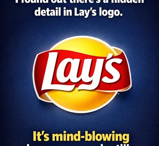
That familiar Lay’s “sun” sitting behind the logo isn’t just a cheerful design choice—it’s a carefully refined echo of something much bigger. Look closely, and you’ll notice it mirrors the golden circle used in the broader Frito-Lay branding. The color palette, the curved red ribbon, even the sense of motion—they all connect back to a shared visual identity. The difference is subtle but intentional: Lay’s simplifies it, softens it, and makes it feel approachable, like it stands on its own while still belonging to a larger family.
You’re not meant to consciously recognize that connection when you reach for a bag. There’s no moment where you think, “Ah, this reminds me of Frito-Lay’s corporate design.” Instead, it works on a deeper level. It creates a sense of familiarity, comfort, and trust that feels almost automatic. It’s the kind of recognition that doesn’t need words—something built quietly over years of repetition, advertising, and presence in everyday life.
But the design goes far beyond brand consistency. It taps directly into psychology.
Yellow is one of the most powerful colors in food marketing. It suggests warmth, happiness, and energy. It catches the eye quickly and often triggers a subtle association with freshness or even sunlight—things we instinctively connect with positivity. Red, on the other hand, is more urgent. It draws attention, stimulates appetite, and creates a sense of excitement. It’s not calm—it’s active, persuasive, and hard to ignore.
When those two colors are combined, the effect becomes even stronger. Together, they create a visual push-and-pull: yellow invites you in with comfort and familiarity, while red nudges you to act—to grab, to taste, to indulge. It’s no accident that these colors dominate not just Lay’s packaging, but the entire snack aisle.
What seems like a simple bag of chips is actually the result of decades of design strategy. Every curve, every shade, every placement of text has been tested and refined to evoke a specific response. The chips themselves haven’t changed much—but the way they’re presented has been engineered to make them feel irresistible.
And that’s the key difference.
You might think you’re choosing between flavors—classic, barbecue, sour cream and onion—but before you even read the label, the packaging has already done its work. It has caught your eye, triggered familiarity, and created a sense of craving before you’ve made a conscious decision.
Lay’s didn’t just become iconic by chance.
It was built to feel inevitable.
To feel like it had always been there.
And in a way, that’s the most powerful kind of branding—when it stops feeling like marketing at all and starts feeling like something you simply trust without question.